


Synced
1. Visual Theme & Atmosphere
Synced is an AI inbox that reads email, texts and DMs, drafts the replies and books the meetings, then waits for a tap to approve. The design has to feel calm and trustworthy while showing that a lot of work happened in the background. It does that with a cool lavender-white canvas, a single saturated indigo, a heavy, friendly serif for headlines, and iOS-native glass and embossed cards for the product itself.
What makes it recognisable:
- One indigo. Every action, link, kicker, focus ring and selection highlight is
#4429F2(hue 248). Every neutral is tinted toward the same hue, so even the greys read faintly violet. - Bold soft serif headlines. P22 Mackinac Pro Bold, tightly tracked (-0.03 to -0.04em), sits on top of a clean sans. The second line of the hero is set in indigo: "Your inbox / on autopilot."
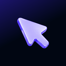
- The cursor mark. A chunky, rounded mouse pointer, lavender inside with an indigo rim, sometimes rendered as a glossy 3D object on a midnight gradient (the app icon).
- Glass and light edges. Buttons carry a 1px gradient rim that is bright at the top-left and shaded at the bottom-right. The nav condenses into a frosted pill on scroll. The iOS app uses Liquid Glass tab bars.
- A sheet on a canvas. On the homepage the content sits on a white, top-rounded "page sheet" (radius 20-32px) inset from the window edges, over the faint lavender page colour.
- Midnight bands. One or two full-bleed sections switch to a grainy indigo-to-midnight gradient (
#06002Ato#12096A) with lavender text, for contrast and drama. - Product UI as the hero. A tilted iPhone showing the inbox, animated mini demos (messages scrolling in, a draft being edited, a booking confirmed) instead of photography.
Density is moderate on the site (large section padding, 1120px column) and compact, iMessage-like on the app.
Mood words: calm, competent, friendly, quiet confidence, iOS-native.
2. Color Palette & Roles
Marketing tokens are defined in HSL (hue 248) on the landing site; the app and web app share a hex palette.
| Name | Hex | Role |
|---|---|---|
| Indigo (web primary) | #4126F2 (hsl(248 89% 55%)) |
Marketing buttons, kickers, links, selection |
| Indigo (app primary) | #4429F2 |
App and web app primary, action tints |
| Indigo Light | #6B56F5 |
Accent tint, hover glows |
| Midnight Ink | #06002A |
Wordmark, dark band gradient start |
| Night Indigo | #12096A |
Dark band gradient middle |
| Dark Band | #0A0820 |
Flat fallback for dark sections |
| Ink | #0B0821 |
Headings and body text on the site |
| Muted Text | #5E5889 |
Sub copy, captions, nav links |
| Border | #DEDCEA |
Card rings, dividers, scrollbar thumb |
| Page | #F6F5FA |
Site background |
| White | #FFFFFF |
Page sheet, cards, secondary buttons |
| Lavender Mark | #C7BEFF (approx.) |
Cursor fill in the logo |
| Lilac Canvas | #EDEAF8 |
App background, light mode |
| Dim Lavender | #A39BD4 |
Dimmed second clause in titles |
| Lavender Text | #F4F2FF |
Headings on dark bands |
| Lavender Sub | #BBB6D8 |
Body text on dark bands |
App palette (light / dark)
| Token | Light | Dark |
|---|---|---|
| primary | #4429F2 |
#9687F8 |
| background | #EDEAF8 |
#0A0A0C |
| text (surface) | #000000 |
#F0EEFF |
| card | #FFFFFF |
#1C1B22 |
| cardBorder | rgba(0,0,0,0.08) |
rgba(255,255,255,0.1) |
| muted text | rgba(0,0,0,0.6) |
rgba(240,238,255,0.6) |
| separator | rgba(0,0,0,0.1) |
rgba(255,255,255,0.08) |
| search field | rgba(0,0,0,0.06) |
rgba(255,255,255,0.08) |
| action tint | rgba(68,41,242,0.10) + border 0.25 |
rgba(150,135,248,0.14) + border 0.3 |
| incoming bubble | #E5E5EA |
#2C2C2E |
| outgoing bubble | #007AFF |
#007AFF |
Muted text was set at 60% alpha on purpose to keep at least 4.5:1 contrast.
Gradients
/* Hero "silk" (animated grain gradient, faded to white behind the copy) */
--synced-silk: #F7F5FF, #DCD4FF, #9C8BFF, #5B43F5;

/* Dark band */
.dark-band {
  background:
    radial-gradient(60% 80% at 85% 20%, rgba(68,41,242,.55), transparent 70%),
    radial-gradient(50% 70% at 10% 90%, rgba(26,15,107,.9), transparent 70%),
    linear-gradient(135deg, #06002A 0%, #12096A 55%, #0B0638 100%);
}
The dark band also gets a fractal-noise grain overlay at 22% opacity.
Semantic
No loud status palette. Pending agent work uses the indigo action tint; errors and success use iOS system red #FF3B30 and green #34C759 (approx.), kept small.
3. Typography
- Display: P22 Mackinac Pro (served from Adobe Fonts on the web, bundled OTFs in the app: Book, Medium, Bold, Extra Bold, plus italics). Used for every h1-h6 on the site, stats, mobile-menu links and the large titles in the app (onboarding, Tasks, Blasts, paywall).
- Body (web): Indivisible from Adobe Fonts at weight 500 by default.
- Body (app and web app): Inter (400, 500, 600, 700). Most UI text is Inter Regular or SemiBold.
- Fallbacks: Mackinac Pro and Indivisible are commercial. Use Fraunces 700 (or the web app's own fallback, Averia Serif Libre) for headlines and Inter for everything else.
--font-display: "p22-mackinac-pro", "Fraunces", Georgia, serif;
--font-body: "indivisible", "Inter", system-ui, -apple-system, sans-serif;
Scale
| Role | Size | Weight | Line height | Tracking |
|---|---|---|---|---|
| Hero h1 | clamp(48px, 6.4vw, 86px) |
700 serif | 1.02 | -0.04em |
| Section title | clamp(32px, 4.4vw, 52px) |
700 serif | 1.05 | -0.03em |
| Stat number | clamp(32px, 3.6vw, 45px) |
700 serif, tabular | 1 | -0.03em |
| App screen title | 22px | 700 serif | 1.2 | -0.3px |
| Lead / hero sub | 16-18px | 500 | 1.62 | 0 |
| Nav link | 15px | 500 | 1 | 0 |
| App body | 15px Inter | 400 | 1.45 | 0 |
| Button | 14px (15px large) | 600 | 1 | 0 |
| Kicker | 12.5px uppercase | 700 | 1.3 | 0.08em |
| App meta | 11-13px Inter | 400-600 | 1.3 | 0 |
Rules
- Headlines in sentence case, ending with a full stop: "Keep Gmail and Outlook." "Private by default."
- Two-tone headlines: the second clause goes indigo (hero) or dim lavender
#A39BD4(dark bands). - Kickers are small, bold, uppercase indigo with 0.08em tracking. Eyebrow pills use 0.1em tracking.
- Stats use
font-variant-numeric: tabular-nums.
4. Logo & Brand Mark
- Mark: a rounded mouse-pointer arrow tilted up-left, with soft corners and a thick rim. Flat versions are lavender fill with an indigo rim; the app icon renders it as glossy 3D lavender-violet plastic on a midnight gradient.
- Wordmark: "Synced" in P22 Mackinac Pro Bold, Midnight Ink
#06002Aon light, white on dark. The mark sits to the left, about the same height as the wordmark including the y descender, with a gap of roughly half the mark's width. - Icon: the cursor alone, centred on the dark gradient square.
- Clear space: at least the width of the mark's tail on all sides.
- Minimum size: 20px tall for the mark; 96px wide for the full lockup.
Misuse: do not set the wordmark in another serif, do not recolour the mark in multiple hues or rainbow gradients, do not rotate it to point another direction, do not add sparkles or stars around it.
5. Components
Buttons (site)
All buttons are 40px tall (44px large, 36px small), 8px radius, 14px/600 text, with a liquid-glass rim drawn by a masked ::before.
.btn-primary {
  height: 40px; padding: 0 19px; border-radius: 8px;
  font: 600 14px/1 var(--font-body);
  color: #FAF9FF; background: #4126F2;
  box-shadow: 0 1px 2px rgba(30,20,80,.22), 0 6px 16px -8px rgba(68,41,242,.5);
  transition: box-shadow .25s ease, filter .2s ease, transform .3s cubic-bezier(.22,1,.36,1);
}
.btn-primary::before { /* 1px rim, lit top-left, shaded bottom-right */
  background: linear-gradient(135deg, rgba(255,255,255,.7) 0%, rgba(255,255,255,.15) 30%,
    transparent 50%, rgba(10,4,60,.15) 70%, rgba(10,4,60,.55) 100%);
}
.btn-primary:hover { filter: brightness(1.08); box-shadow: 0 1px 2px rgba(30,20,80,.22), 0 10px 22px -10px rgba(68,41,242,.6); }
.btn-primary:active { transform: scale(.97); }

.btn-secondary {
  color: #0B0821;
  background: linear-gradient(180deg, rgba(255,255,255,.96), rgba(255,255,255,.86));
  box-shadow: inset 0 1px 1px rgba(255,255,255,.95), inset 0 -1px 2px rgba(35,27,72,.06),
    0 0 0 1px rgba(222,220,234,.9), 0 6px 16px -8px rgba(35,27,72,.22);
}
.btn-secondary:hover { /* presses in */
  background: linear-gradient(180deg, rgba(236,233,250,.7), rgba(246,244,253,.75));
  box-shadow: inset 0 2px 5px rgba(35,27,72,.16), 0 0 0 1px rgba(222,220,234,.9);
  transform: translateY(.5px);
}
:focus-visible { outline: 3px solid rgba(65,38,242,.28); outline-offset: 3px; }
On desktop the primary CTA upgrades to a "specular" button whose edge light follows the pointer. A trailing arrow is common ("Get Early Access →").
App buttons
- GlassPrimaryButton: full-width capsule, indigo fill, white 16-17px Inter SemiBold, Liquid Glass on iOS 26.
- GlassIconButton / GlassIconGroup: 44px circular glass buttons for header actions.
- Minimum tap target 44pt everywhere.
Navigation
- Site: fixed header, 48px inner row. At the top it spans the window; on scroll it condenses into a 1120px pill, 18px radius, frosted
rgba(255,255,255,.8)withbackdrop-filter: blur(18px) saturate(170%)and a hairline ring. Links 15px/500 in muted text, ink on hover. Product dropdown is a 440px two-column white card, 16px radius. - App: five-tab native tab bar (Inbox, Blasts, Sync, Tasks, Account) using Phosphor icons and the cursor mark for the centre "Sync" tab; Liquid Glass with numeric badges.
Cards
- Site feature card: white, 20px radius, 24px padding,
0 0 0 1px rgba(222,220,234,.8), 0 14px 34px -24px rgba(35,27,72,.25). Hover lifts 3px and the ring turns indigo at 28%. - Demo panel ("viz"): 300px tall, 22px radius, lavender gradient
#F5F4FBto#ECEAF5, inset 1px ring, with animated UI inside. - App message card: 20px radius, continuous corners. Header row: 36px round avatar, sender in Inter SemiBold 15px, preview in muted 13-15px. Active cards are "embossed": same colour as the page, lit from the top (
#FBFAFFto#F2F0FB), a bright 1px rim and a soft lift shadow. - Pinned Agent row: indigo action tint at 5-10% with a matching border.
Inputs
- Search fields:
rgba(0,0,0,0.06)fill, no border, 10-14px radius, 15px Inter, muted placeholder. - Compose fields: card background, 14px radius, @mentions render as indigo SemiBold chips.
Badges and pills
- Hero pill: white at 80% with blur, 999px radius, 13px/600, a 7px indigo dot with a 4px indigo halo.
- Eyebrow: indigo text on indigo 8% fill, 1px indigo 18% border, uppercase 12px/700.
- Tags in app: 6px radius, 11px SemiBold.
Lists and threads
Message threads look like iMessage: grey incoming bubbles, blue #007AFF outgoing, 18px bubble radius. Swipe a card to skip, tap to approve. Bulk actions slide up in a glass bar.
6. Layout & Spacing
- Container: 1120px max, padding
clamp(16px, 5vw, 32px). - Page sheet: inset
clamp(8px, 1.1vw, 14px)from the window, 84px from the top, top cornersclamp(20px, 2.4vw, 32px). - Section padding:
clamp(72px, 9vw, 128px)vertical; dark bands up to 144px. - Hero grid: two columns
1.08fr / .92fr, copy left, tilted phone right; collapses to one column under 880px. - Grids: three steps across, two-column security and integrations groups, 16-20px gaps.
- Breakpoints: 640px (phone), 880px (nav collapses), 1040px (tight nav).
- App spacing: 14-16px horizontal padding, 8-10px gaps, radii xs 6, sm 10, md 14, lg 20, xl 26, all with continuous corners and concentric nesting (inner radius = outer minus inset).
7. Depth, Elevation & Motion
Elevation
- Shadows are long and soft and tinted indigo-navy (
rgba(35,27,72,…),rgba(68,41,242,…)), never neutral black on light surfaces. - Hairline rings are drawn with
box-shadow: 0 0 0 1pxrather than borders. - Glass:
backdrop-filter: blur(10-18px) saturate(170%)on white at 66-80%. - Page sheet:
0 0 0 1px hsl(248 25% 89% / .7), 0 30px 80px -40px rgba(35,27,72,.18).
Motion
- One easing curve on the site:
cubic-bezier(.22, 1, .36, 1). Web app usescubic-bezier(0.2, 0, 0, 1)for 120-220ms fades. - Press: scale .97 over 80ms.
- Reveal on scroll: fade plus a small rise, staggered 80ms.
- Demo loops: message lists scroll continuously (16s linear), rings pulse outward (4.5s), drafts get struck through and rewritten.
- Hero phone tilts in 3D with perspective 1800px and follows the pointer slightly.
- All of it switches off under
prefers-reduced-motion.
8. Iconography & Imagery
- Icons: Phosphor in the app and web app (regular weight, filled for active tabs), Lucide on the marketing site. 16-24px, stroke 1.5-2, coloured indigo or muted text.
- Third-party logos: full-colour brand marks inside white squircle tiles.
- Imagery: product screens, the tilted iPhone and the 3D cursor. No stock photos. Founder photos appear only on the team page.
9. Voice & Microcopy
Short, plain and reassuring. Talks to the person who handles someone else's inbox (often an executive assistant). Promises that nothing goes out without approval.
- Sentence case everywhere, full stops on headlines.
- Pairs of short sentences: what Synced does, then what you do.
- Verbs: reads, books, writes, drafts, approve, tap, swipe.
Sample strings:
- Hero: "Your inbox on autopilot."
- Sub: "Synced reads every message for you and the people you support, books the meetings and writes the replies. You approve each one with a tap."
- Steps: "Reads everything." "Does the work." "You sign off. Tap to send. Swipe to skip."
- Sections: "Built for assistants." "Keep Gmail and Outlook." "Private by default."
- CTAs: "Get Early Access", "See how it works".
- App tabs: "Inbox", "Blasts", "Sync", "Tasks", "Account".
10. Do's and Don'ts
Do
- Use one indigo for every action and keep neutrals tinted toward hue 248.
- Set headlines in a heavy soft serif with tight negative tracking and a full stop.
- Put the product on screen: phone mockups, cards, drafts, booking confirmations.
- Use glass rims and indigo-tinted soft shadows for depth.
- Give cards continuous (squircle) corners and keep nested radii concentric.
- Keep one dark gradient band per page for contrast.
Don't
- Don't add a second accent hue or rainbow gradients.
- Don't use pure grey shadows or hard 1px black borders.
- Don't set body copy in the serif or headlines in a thin sans.
- Don't use stock photos, robot illustrations or sparkle icons for "AI".
- Don't imply Synced sends without approval.
11. Agent Prompt Guide
Paste this into an AI coding agent:
Build this UI in the style of Synced, an AI inbox. Light lavender-white page
#F6F5FAwith a white content sheet (top corners 24-32px), headings in deep ink#0B0821, body in muted violet-grey#5E5889. Headlines use a heavy soft serif ("p22-mackinac-pro", Fraunces, serif, weight 700, tracking -0.03 to -0.04em, line-height ~1.05) and end with a full stop; the second line of the hero is indigo. Body usesInterweight 500 at 16-18px, line-height 1.6. The only accent is indigo#4429F2: primary buttons are 40px tall, 8px radius, 14px/600 white text, with a 1px glass rim lit top-left and the shadow0 1px 2px rgba(30,20,80,.22), 0 6px 16px -8px rgba(68,41,242,.5). Secondary buttons are white glass with a hairline ring that press in on hover. Cards are white, 20px radius, hairline ringrgba(222,220,234,.8)plus a long soft indigo-tinted shadow. Kickers are 12.5px bold uppercase indigo, 0.08em tracking. Add one full-bleed dark band with a grainy gradient from#06002Athrough#12096Aand lavender text#F4F2FF. The nav condenses into a frosted pill on scroll. Show product UI (an iPhone inbox with embossed message cards, iMessage-style bubbles) instead of photos. Easingcubic-bezier(.22,1,.36,1), press scale .97. Copy is short, sentence case, reassuring.
:root {
  --brand-primary: #4429F2;
  --brand-primary-web: #4126F2;
  --brand-primary-light: #6B56F5;
  --brand-primary-dark-mode: #9687F8;
  --brand-midnight: #06002A;
  --brand-night: #12096A;
  --brand-ink: #0B0821;
  --brand-text-muted: #5E5889;
  --brand-border: #DEDCEA;
  --brand-bg: #F6F5FA;
  --brand-card: #FFFFFF;
  --brand-app-bg: #EDEAF8;
  --brand-app-bg-dark: #0A0A0C;
  --brand-card-dark: #1C1B22;
  --brand-lavender: #C7BEFF;
  --brand-lavender-text: #F4F2FF;
  --brand-dim: #A39BD4;
  --brand-bubble-out: #007AFF;
  --brand-action-bg: rgba(68, 41, 242, 0.10);
  --brand-action-border: rgba(68, 41, 242, 0.25);
  --brand-font-display: "p22-mackinac-pro", "Fraunces", Georgia, serif;
  --brand-font-body: "indivisible", "Inter", system-ui, -apple-system, sans-serif;
  --brand-radius-btn: 8px;
  --brand-radius-md: 14px;
  --brand-radius-lg: 20px;
  --brand-radius-pill: 999px;
  --brand-shadow-btn: 0 1px 2px rgba(30,20,80,.22), 0 6px 16px -8px rgba(68,41,242,.5);
  --brand-shadow-card: 0 0 0 1px rgba(222,220,234,.8), 0 14px 34px -24px rgba(35,27,72,.25);
  --brand-shadow-menu: 0 20px 55px rgba(35,27,72,.1);
  --brand-glass: blur(18px) saturate(170%);
  --brand-ease: cubic-bezier(.22, 1, .36, 1);
}
Values are observed from the public product and published brand guidelines; this file is an unofficial reference and is not affiliated with or endorsed by Synced.