
Suno
1. Visual Theme & Atmosphere
Suno is an AI music app: you type a prompt or lyrics, it returns full songs, and the product is built around a feed of tracks, a create panel and a persistent player. The web app at suno.com renders dark by default (<html data-theme="dark">), with a near-black page #101012, warm cream text #F7F4EF and a soft orange-to-pink "aura" glow used sparingly on hero art, featured plan buttons and the app icon.
What makes it recognisable:
- Warm neutrals, not cold greys. The neutral ramp is called
dumboand leans slightly warm:#101012,#1C1C1F,#252529on dark and#F7F4EF,#EDEAE4on light. Pure#000and#FFFare rare in surfaces. - The aura. A blurred orange, amber and pink gradient (the app icon is a glowing orange disc fading to pink with the white SUNO wordmark). It appears behind the hero, on featured buttons (an image
aura_horizontal.jpgis used as the button background) and around album art. - Cover art carries the color. UI chrome stays neutral so square song covers, each AI-generated and colorful, do the visual work in feeds and playlists.
- Glass and fog layers. Overlays use translucent whites and blacks named fog, smoke and glass (
rgba(255,255,255,0.04)up to0.30), often with a backdrop blur, rather than solid grey panels. - Pill controls. Primary buttons are cream pills on black; the create button and filters are pills too.
- Editorial serif accent. The marketing pages pair Neue Montreal with Editorial New, a thin high-contrast serif, for occasional large italic words.
Mood words: late-night studio, warm, playful, creative, dense feed.
2. Color Palette & Roles
All values below come from the production CSS custom properties on suno.com (Tailwind v4 theme with semantic aliases). The site supports dark and light; dark is the default.
| Name | Hex | Role |
|---|---|---|
| dumbo-50 (Studio Black) | #101012 |
--color-background-primary (dark), primary button text |
| dumbo-100 | #1C1C1F |
--color-background-secondary (dark): cards, sidebar |
| dumbo-150 | #252529 |
--color-background-tertiary, inactive button fill |
| dumbo-200 | #2E2E33 |
Hover surface, input fill |
| dumbo-250 | #38383E |
Solid divider |
| dumbo-450 | #6A6A72 |
Inactive foreground on dark |
| dumbo-600 | #A3A3A3 |
Tertiary text on dark |
| dumbo-700 | #C2C2C1 |
Secondary text on dark |
| dumbo-850 | #EDEAE4 |
Secondary background in light theme |
| dumbo-900 (Cream) | #F7F4EF |
Primary text on dark, primary button fill on dark |
| dumbo-950 | #FCFBF9 |
Light theme page, button text on light |
| Strawberry 600 | #FD429C |
--color-accent-brand on dark |
| Strawberry 500 | #DE1677 |
Brand accent on light |
| Pumpkin 500 | #FF6A00 |
Orange accent |
| Dandelion 700 | #F5D907 |
Yellow accent, warning |
| Dodger Blue 600 | #1F8BFF |
Blue accent, info |
| Slime 600 | #02D95C |
Green accent |
| Amethyst 600 | #8B6EFE |
Purple accent |
Translucent layers
| Token | Dark value | Use |
|---|---|---|
| border-primary | rgba(255,255,255,0.10) |
Card and input borders |
| border-secondary | rgba(255,255,255,0.15) |
Hover borders, popovers |
| glass-thin | rgba(255,255,255,0.04) |
Secondary button fill |
| glass-thick | rgba(255,255,255,0.10) |
Chips, segmented controls |
| fog-dense | rgba(255,255,255,0.30) |
Overlay controls on cover art |
| dark overlay | rgba(0,0,0,0.30) |
Scrim behind modals |
Semantic colors
| State | Hex | Use |
|---|---|---|
| Success | #4AAB04 (grass-500) on light, #317203 text |
Saved, published |
| Error | #F8441B (vermilion-500), #C32906 on light |
Failed generation, form errors |
| Warning | #F5D907 |
Credit warnings, beta labels |
| Info | #1F8BFF |
Tips, links in notices |
Aura gradient
The icon and featured surfaces use a warm radial blend. Approximate stops, matched by eye to the app icon:
.suno-aura {
  background: radial-gradient(120% 120% at 30% 20%, #FFB300 0%, #FF6A00 45%, #FD429C 100%);
}
Light mode
Light theme swaps the ramp: page #FCFBF9, secondary #EDEAE4, text #101012, secondary text #5B5B62, borders rgba(0,0,0,0.10). Accents shift one step darker (strawberry #DE1677, blue #0071EA).
3. Typography
Families (from --font-sans, --font-serif, --font-mono):
- Sans: Neue Montreal (Pangram Pangram). Used for everything in the app.
- Serif: Editorial New (Pangram Pangram), for large display words on marketing pages.
- Mono: Input Sans (DJR), for small technical labels.
Licensing: all three are commercial. Free substitutes: Inter for Neue Montreal, Instrument Serif for Editorial New, JetBrains Mono for mono.
font-family: "Neue Montreal", ui-sans-serif, system-ui, sans-serif;
Scale
Sizes follow Tailwind steps (--text-sm 14px, --text-base 16px and so on). Display sizes approximate from the homepage hero.
| Role | Size | Weight | Line height | Tracking |
|---|---|---|---|---|
| Hero ("Make any song you can imagine") | 72px (approx.) | 500 | 1.0 | -0.03em |
| Display | 48px | 500 | 1.05 | -0.02em |
| Section heading | 28-40px | 500 | 1.15 | -0.01em |
| Card title / song title | 15-18px | 500 | 1.3 | 0 |
| Body | 16px | 400 | 1.5 | 0 |
| Small / metadata | 14px | 400 | 1.43 | 0 |
| Caption / tags | 12px | 400 | 1.33 | 0 |
Mobile hero drops to about 40px.
Rules
- Sentence case everywhere: "Create", "Make your own masterpieces", "Start making music for free".
- Song titles are 500 weight, artist handles 400 in secondary text
#C2C2C1. - Use tabular figures for durations (
2:41) and play counts. - Keep weights low. Bold 700 is almost never used; 500 is the emphasis weight.
- The serif is a display accent only, often one word in a headline, never body text.
4. Logo & Brand Mark
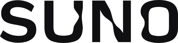
The logo is the SUNO wordmark: four geometric uppercase letters with rounded terminals and a distinctive "N" whose diagonal is drawn as a soft curve. It ships as an inline SVG (viewBox="0 0 606 149", fill="currentColor"), so it inherits text color: cream on dark, near-black on light.
- App icon: the white wordmark centred on a glowing orange disc that fades to pink at the lower edge. On iOS it sits in a rounded square.
- Clear space: at least the height of the "S" on all sides.
- Minimum size: about 64px wide on screen.
- Color versions:
#F7F4EFor#FFFFFFon dark,#101012on light, white on the aura gradient.
Misuse:
- Do not retype "SUNO" in another font or in lowercase.
- Do not fill the wordmark with the aura gradient; the gradient goes behind it.
- Do not add a music note or waveform to the mark.
- Do not stretch or track out the letters.
5. Components
Buttons
The button primitive (hxc-btn) is driven by variables: background, radius, padding and an optional background image.
| Variant | Background | Text | Radius | Height / padding |
|---|---|---|---|---|
| Primary | #F7F4EF |
#101012 500 14-16px |
9999px | 40px, 0 20px |
| Secondary | rgba(255,255,255,0.04) + 1px rgba(255,255,255,0.10) |
#F7F4EF |
9999px | 40px, 0 16px |
| Tertiary / ghost | transparent | #F7F4EF |
8px | 32-36px, 0 12px |
| Brand | #FD429C |
#000000 |
9999px | 40px |
| Featured plan | aura image or gradient | #FFFFFF |
9999px | 48px |
| Icon button | rgba(255,255,255,0.10) |
#F7F4EF |
9999px | 32-40px square |
| Destructive | #F8441B |
#FFFFFF |
9999px | 40px |
States: hover lightens the fill one step (cream to #FCFBF9, glass 4% to 10%), pressed scales to 0.97, focus ring 2px solid #F7F4EF offset 2px, disabled background #252529 with text #6A6A72. Transition 150ms cubic-bezier(.4,0,.2,1).
.suno-btn-primary {
  font: 500 15px/1 "Neue Montreal", Inter, system-ui, sans-serif;
  background: #F7F4EF;
  color: #101012;
  height: 40px;
  padding: 0 20px;
  border-radius: 9999px;
  border: 0;
  transition: background-color .15s cubic-bezier(.4,0,.2,1), transform .15s;
}
.suno-btn-primary:hover { background: #FCFBF9; }
.suno-btn-primary:active { transform: scale(.97); }
Create panel and prompt input
The create panel is the heart of the app: a column on the left of the workspace with a large textarea ("Describe the song you want"), style tags, an instrumental toggle and the Create button.
- Textarea: background
#1C1C1F, border 1pxrgba(255,255,255,0.10), radius 12px, padding 12px 14px, text 15px cream, placeholder#6A6A72. Focus borderrgba(255,255,255,0.30). - Style tags: pills 28px tall, background
rgba(255,255,255,0.10), text 13px, padding 0 12px, a small plus icon. - Toggles: 36x20px track, off
#38383E, on#F7F4EF, knob dark when on. - Create button: full width, 48px, pill, cream fill with a dark label, or the aura gradient in promotional states.
Song row and song card
- Row (library, playlists): 64px tall, 48px square cover with 6px radius, title 15px 500, style tags 13px
#A3A3A3truncated, duration right aligned in tabular figures, a three-dot menu that appears on hover. Hover backgroundrgba(255,255,255,0.04). - Card (explore feed): square cover with 8-12px radius, a play button that fades in over the art (40px circle,
rgba(0,0,0,0.5)with backdrop blur), then title, creator avatar (20px circle) and handle, play and like counts in 12px.
Player bar
Fixed to the bottom, about 72px tall, background #101012 with a 1px top border rgba(255,255,255,0.10). Left: 48px cover, title, artist. Centre: previous, play (40px cream circle with dark icon), next, and a 4px progress bar with a cream fill on a #38383E track. Right: volume, like, queue.
Navigation
- App sidebar: 240px, background
#101012, items 40px tall with 20px icons, 14px labels, active item backgroundrgba(255,255,255,0.10)and radius 8px. Credits counter near the bottom. - Marketing header: sticky, transparent over the hero, then
rgba(16,16,18,0.8)with backdrop blur; logo left, links centre, "Sign in" ghost and "Sign up" cream pill right.
Chips, badges and tabs
- Filter chips: pill, 32px, inactive
rgba(255,255,255,0.04)with border, active cream fill and dark text. - Version badge (e.g. model version): 11-12px uppercase-free label, 4px radius,
rgba(255,255,255,0.10)fill. - Tabs: text tabs 14px, inactive
#A3A3A3, active cream with a 2px underline.
Modals and menus
Popups use radius 20-26px on large sheets and 8px on small menus, background #1C1C1F, an inset 1px white-10% ring plus a soft drop shadow, and a rgba(0,0,0,0.30) scrim. Menu items 36px tall, 14px text, hover rgba(255,255,255,0.04).
Pricing cards
Three or four cards on #1C1C1F with 12-16px radius. The featured plan has the aura behind its button and a thin glowing border. Prices are large 500 weight figures; feature lists use small check icons in cream.
6. Layout & Spacing
- App shell: left sidebar 240px, main workspace fluid, optional right panel 360-400px for song details or lyrics, player bar fixed at the bottom.
- Marketing pages: centred content up to about 1280px, hero text centred with a max width near 720px.
- Gutters: 16px on mobile, 24px tablet, 32px desktop.
- Base unit: 4px. Common steps 8, 12, 16, 24, 32; section spacing 64-96px on marketing pages.
- Grids: explore feed uses 2 columns on mobile, 4-6 on desktop, 16px gap.
- Breakpoints: Tailwind defaults (640, 768, 1024, 1280, 1536px).
- Density: high in the app (tight rows, small metadata), relaxed on marketing.
7. Depth, Elevation & Motion
- Elevation by lightness: page
#101012, cards#1C1C1F, menus#252529. Shadows are rare in dark mode. - Borders: 1px translucent white (10-15%) instead of solid lines.
- Blur: fog and glass layers use
backdrop-filter: blur(16px); the button backdrop blur token is1rem. - Glow: a soft white glow
0 0 10px 2px rgba(255,255,255,0.16)on focused or playing items; tinted inset glows (inset 0 0 8px 2pxat 45% of an accent) mark warning and error cards. - Durations: default 150ms, toasts and accordions up to 300ms.
- Easing: default
cubic-bezier(.4,0,.2,1), entrancecubic-bezier(0,0,.2,1), accordioncubic-bezier(.16,1,.3,1), toastcubic-bezier(.22,1,.36,1). - Signature motion: the logo paths animate their shapes slowly (
transition: d 3s), and the aura drifts. Waveforms and progress bars update live while a song plays.
8. Iconography & Imagery
- Icons: simple line icons, 1.5-2px stroke, rounded joins, 20px in navigation and 16px inline. Filled variants for active states (filled heart for liked, filled play).
- Cover art: square, generated per song, shown with 6-12px radius. Never crop to circles except creator avatars.
- Avatars: circles, 20-40px, with a fallback gradient fill.
- Marketing imagery: large blurred aura fields, phone and app screenshots, and logos of press outlets in monochrome cream.
- Waveforms: thin vertical bars in cream at 30-100% opacity.
9. Voice & Microcopy
Friendly, short and creative. Talks to musicians and non-musicians alike. Strings seen on the live homepage today:
- "Make any song you can imagine"
- "Start making music for free"
- "Make your own masterpieces"
- "Create songs", "Create album", "Get inspired"
- Buttons: "Create", "Sign up", "Sign in"
Rules: sentence case, second person, verbs first. Avoid technical model jargon in primary UI; version labels are small and secondary.
10. Do's and Don'ts
Do
- Default to dark:
#101012page,#F7F4EFtext. - Use the warm
dumboneutrals and translucent white borders. - Let colorful square cover art carry the color.
- Use cream pill buttons for primary actions.
- Keep the aura gradient for one hero area or one featured button per view.
- Use Neue Montreal (or Inter) at 400 and 500 only.
Don't
- Don't use cold blue-greys or pure black panels for surfaces.
- Don't spread accent pink across many controls; it is a highlight.
- Don't add heavy drop shadows in dark mode.
- Don't set body text in the serif.
- Don't use bold 700 headlines.
- Don't use sparkle or magic-wand icons for generation.
11. Agent Prompt Guide
Paste this into an AI coding agent:
Build this UI in the style of Suno, the AI music app. Dark by default: page
#101012, cards#1C1C1F, raised surfaces#252529, text warm cream#F7F4EF, secondary text#C2C2C1, tertiary#A3A3A3. Borders are 1pxrgba(255,255,255,0.10). Font: "Neue Montreal" with Inter as fallback, weights 400 and 500 only, headings with slight negative tracking. Primary buttons are cream pills (#F7F4EFfill,#101012text, 40px tall, fully rounded); secondary buttons arergba(255,255,255,0.04)pills with a translucent border. Brand accent pink#FD429C, orange#FF6A00, yellow#F5D907used sparingly. Use one warm aura gradient (amber#FFB300to orange#FF6A00to pink#FD429C) behind the hero or one featured button. Layout: left sidebar 240px, a create panel with a large prompt textarea (12px radius) and style-tag pills, a feed of square cover-art cards (8-12px radius) and a fixed bottom player bar with a cream play circle and 4px progress bar. Motion 150mscubic-bezier(.4,0,.2,1). Copy is short and friendly: "Make any song you can imagine".
:root {
  --brand-bg: #101012;
  --brand-surface: #1C1C1F;
  --brand-surface-raised: #252529;
  --brand-surface-hover: #2E2E33;
  --brand-text: #F7F4EF;
  --brand-text-secondary: #C2C2C1;
  --brand-text-tertiary: #A3A3A3;
  --brand-text-inactive: #6A6A72;
  --brand-border: rgba(255,255,255,0.10);
  --brand-border-strong: rgba(255,255,255,0.15);
  --brand-glass: rgba(255,255,255,0.04);
  --brand-glass-thick: rgba(255,255,255,0.10);
  --brand-pink: #FD429C;
  --brand-pink-deep: #DE1677;
  --brand-orange: #FF6A00;
  --brand-yellow: #F5D907;
  --brand-blue: #1F8BFF;
  --brand-green: #02D95C;
  --brand-error: #F8441B;
  --brand-aura: radial-gradient(120% 120% at 30% 20%, #FFB300 0%, #FF6A00 45%, #FD429C 100%);
  --brand-font: "Neue Montreal", "Inter", ui-sans-serif, system-ui, sans-serif;
  --brand-font-serif: "Editorial New", "Instrument Serif", Georgia, serif;
  --brand-font-mono: "Input Sans", "JetBrains Mono", ui-monospace, monospace;
  --brand-radius-sm: 6px;
  --brand-radius-md: 8px;
  --brand-radius-lg: 12px;
  --brand-radius-xl: 20px;
  --brand-radius-pill: 9999px;
  --brand-ease: cubic-bezier(.4,0,.2,1);
  --brand-ease-out: cubic-bezier(0,0,.2,1);
  --brand-duration: 150ms;
}
Values are observed from the public suno.com product CSS on 2026-11-16; display sizes and the aura gradient stops are approximate. This file is an unofficial reference and is not affiliated with or endorsed by Suno.