

Minecraft
1. Visual Theme & Atmosphere
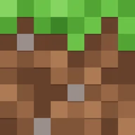
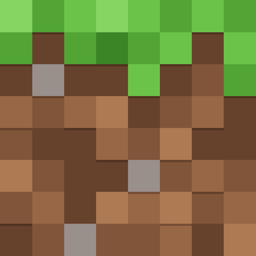
Minecraft looks like the game it sells: everything is made of square blocks. The brand rests on three things people recognise at a glance: the chunky stone "MINECRAFT" wordmark with a creeper face hidden in the "A", the grass block (a green top over brown dirt), and pixel art drawn on an 8x8 or 16x16 grid. minecraft.net turns those into a web system with zero border radius, 2px black outlines, bevelled buttons that look like in-game UI, and small animated pixel sprites (pigs, bees, creepers) that wander along section edges.
What makes it recognisable:
- Hard corners everywhere. The component library sets
border-radius: 0on almost every element. Buttons, cards, tabs, modals and inputs are rectangles. - Bevelled game buttons. Primary buttons are solid green with a 2px near-black border and a 6px darker strip along the bottom (
inset 0 -6px 0), so they read as a raised block you can press. On press, the strip vanishes and the fill darkens. - Earth palette. Grass greens (
#6CC349to#2A641C), dirt browns (#C28E64to#492D1F) and warm stone greys (#EDE5E2to#171615). The greys are slightly pink and brown, never blue. - Dark header, mixed sections. A 80px translucent deepslate header (
rgba(38,36,35,0.9)with a 10px backdrop blur) sits over full-bleed key art. Sections alternate between dark stone, off-white#FCF5F1and photographic or rendered game scenes. - Two type voices. A blocky custom display face (Minecraft Ten) for headlines and Noto Sans for everything readable. The in-game pixel font (Minecraft Seven) shows up in badges, tooltips and game-adjacent UI.
- Per-game themes. The same components are recoloured per title through theme classes: Vanilla (green), Dungeons (orange and mulberry), Legends (light blue), Realms (purple and pink), Marketplace (gold).
Mood words: playful, chunky, earthy, tactile, friendly.
2. Color Palette & Roles
All values below are CSS custom properties read from mc-components.min.css on minecraft.net (November 2026). Names in brackets are the site's own token names.
| Name | Hex | Role |
|---|---|---|
Green 1 / 2 (--mc-core-green-*) |
#A0E081 / #86D562 |
Pressed outline text; badge fill, outline hover text |
| Green 3 | #6CC349 |
Links on dark, outline-button text, grass top |
| Green 4 | #52A535 |
Badge shadow, grass mid-tone |
| Green 5 | #3C8527 |
Primary button fill |
| Green 6 | #2A641C |
Button bevel, pressed fill, link color on light |
| Brown 1-6 | #C28E64 #AD7A54 #976746 #805539 #66412C #492D1F |
Dirt texture, wood, earthy accents |
| Grey 1 / 2 | #EDE5E2 / #D0C5C0 |
Light surfaces; secondary text on dark, light borders |
| Grey 3 / 4 | #ABA09C / #6B6562 |
Disabled icons, captions; muted text on light |
| Grey 5 / 6 | #3D3938 / #262423 |
Raised dark surfaces, hover; header, dark panels |
| Off Black | #171615 |
Darkest surface, 2px button borders |
| Off White | #FCF5F1 |
Light page background |
| White | #FFFFFF |
Text on dark and on green buttons |
| Footer | #111111 |
Global footer background |
Gradients used as fills (also tokens):
- Green:
linear-gradient(180deg, #6CC349, #52A535 50%, #3C8527) - Dark grey:
linear-gradient(180deg, #3D3938, #262423 50%, #171615) - Light grey:
linear-gradient(180deg, #FCF5F1, #EDE5E2 50%, #D0C5C0)
Semantic colors
| Role | Hex |
|---|---|
| Focus ring | #1157BE |
| Warning / error | #CA3636 (on dark #FF605E) |
| Caution | #E2B923 |
Sub-brand themes
| Theme | Key colors |
|---|---|
| Vanilla (Minecraft) | Green 5 #3C8527, Green 3 #6CC349 |
| Marketplace | Gold #FFC42B, Gold 2 #FFD953, Gold 6 #94540E |
| Realms | Deep blue #643ACB, #210A80, pink #E833C2 |
| Dungeons | Orange #FFA41F, #DE5B0D, mulberry #530F33 |
| Legends | Light blue #4AD5FF, dark blue #003BAB, ultra dark #071927 |
Light and dark: there is no user-facing dark mode toggle. Each section picks a background (MC_Bg_Core__off-black, MC_Bg_Core__off-white and so on) and text flips between white and rich black to match.
3. Typography
- Minecraft Ten (v2): the display face. Blocky, heavy, all-caps friendly, close in spirit to the wordmark. Used for H1 to H4 in the Vanilla and Realms themes. Proprietary to Mojang; not licensed for outside use. Fallback: Pixelify Sans (approximate match, it is rounder) or simply Noto Sans 800 in caps.
- Minecraft Seven (v2): the in-game pixel font. Used in Legends-themed UI, badges and anything that imitates the game HUD. Fallback: VT323 or Pixelify Sans (approximate).
- Noto Sans: the body and button face (
--mc-default--fontlist: "Noto Sans", "Helvetica Neue", Helvetica, Arial, sans-serif). Free on Google Fonts.
| Role | Font | Size / line height | Weight | Tracking |
|---|---|---|---|---|
| H1 (desktop) | Minecraft Ten | 72 / 72px | 400 | -0.015em |
| H1 (tablet / mobile) | Minecraft Ten | 64px, then 48px | 400 | -0.015em |
| H2 | Minecraft Ten | 56 / 56px (32px mobile) | 400 | -0.015em |
| H3 | Minecraft Ten | 40 / 40px | 400 | 0.04em |
| H4 | Minecraft Ten | 24 / 28px | 400 | 0 |
| H5 | Noto Sans | 18 / 24px | 600 | -0.015em |
| H6 | Noto Sans | 16 / 20px | 600 | 0 |
| Body | Noto Sans | 16 / 24px (approx.) | 400 | 0 |
| Button | Noto Sans | 16 / 16px | 600 | 0.03em |
| Hero outline button | Noto Sans | 18 / 20px, uppercase | 800 | 0.03em |
Rules:
- Headline line-height equals font size (1.0). The blocky face has no descender trouble, so stack lines tight.
- Footer headings and hero outline buttons are uppercase with positive tracking (1px or 0.03em). Body copy is sentence case.
- Never set long paragraphs in the pixel fonts. Pixel faces are for short labels only.
4. Logo & Brand Mark
- Wordmark: "MINECRAFT" in custom block letters with a stone texture. Each letter is a 3D slab: a light stone face (
#EDE5E2to#D0C5C0gradient), grey crack details (#998F8B,#6B6562), and a dark extruded side (#3D3938,#262423,#171615) along the bottom and right. A thin black outline wraps the whole word. - Creeper face: the counter of the "A" holds a small creeper face. It is part of the logo, not a separate badge.
- Grass block: the app icon and favicon use the side of a grass block: an 8x8 pixel grid with a green top two rows (
#86D562,#6CC349,#52A535,#3C8527) dripping into brown dirt (#AD7A54,#976746,#805539,#66412C) with a few grey stone pixels (#998F8B). - Creeper head: the green pixel creeper face is the most used secondary mark (merch, launcher icon).
- Clear space: about the height of one letter's extrusion (roughly 10% of the logo height) on every side (approximate).
- Minimum size: about 120px wide on screen; below that the stone texture turns to noise. The site header uses it at 300x51 viewBox scaled to header height.
Misuse:
- Don't redraw the wordmark in a font, including Minecraft Ten.
- Don't round the letter corners, add gradients, or remove the creeper face.
- Don't put the grass block on a rounded, glossy or drop-shadowed tile.
5. Components
Component names below are the site's own (MC_Button_Primary, MC_globalHeaderA and so on).
Buttons
Primary (MC_Button_Primary, Vanilla theme):
.btn-primary {
  display: inline-flex; min-width: 90px;
  padding: 12px 13px; font: 600 16px/16px "Noto Sans", sans-serif;
  letter-spacing: 0.03em; color: #fff;
  background: #3C8527;
  border: 2px solid #171615; border-radius: 0;
  box-shadow: inset 0 -6px 0 #2A641C;   /* bottom bevel */
}
.btn-primary:hover  { background: linear-gradient(0deg, rgba(0,0,0,.1), rgba(0,0,0,.1)), #3C8527; }
.btn-primary:active { background: #2A641C; box-shadow: none; }
.btn-primary:focus  {
  outline: 2px solid #fff; outline-offset: -2px;
  box-shadow: 0 0 0 1px #1157BE, inset 0 -6px 0 #2A641C;
}
Some variants add an inner highlight via ::before covering all but the bottom 6px: box-shadow: inset 2px 2px 0 0 rgba(255,255,255,0.2), inset -2px -2px 0 0 rgba(255,255,255,0.1). This gives the pressed-in pixel edge from the game's menu buttons.
- Secondary (
MC_Button_Secondary): same shape, 11px vertical padding, light fill such as off-white#FCF5F1with a#ABA09Cbevel and#3D3938text. - Hero (
MC_Button_Hero): 18px/20px text,15px 28pxpadding, 2px#262423border. Used for the main hero CTA ("Get Minecraft"). - Hero outline (
MC_Button_Hero_Outline, header "Buy Now"): transparent fill, 2px#3C8527border,#6CC349text, weight 800, uppercase, 0.03em tracking, min-height 50px,8px 24pxpadding. Hover fill#343E40and text#86D562; active fillrgba(60,133,39,0.1). - Text link with arrow (
MC_Glyph_Link_B): button or link with a trailing square arrow glyph, 12px gap. - Disabled:
aria-disabled="true"drops the bevel; icons switch to#ABA09C.
Global header (MC_globalHeaderA)
- Height 80px,
background: rgba(38,36,35,0.9),backdrop-filter: blur(10px),border-bottom: 1px solid #000,box-shadow: 0 4px 0 0 rgba(0,0,0,0.25). Sticky on scroll. - Left: the wordmark logo. Centre: top-level items "Games", "Shop", "Explore", "Community" with chevrons. Right: search, account and the green outline "Buy Now" button.
- Opening an item drops a mega menu of poster tiles (game key art with a title under each), grouped in columns. Mobile uses a full-height slide menu with a "Back" row per level, and the hamburger is a hexagon-shaped pixel icon.
- Max content width 1920px, 16px inner padding.
Cards and media blocks
- Cards have no radius and no shadow. They are a key-art image (often with a soft pixel particle overlay) over a title in Minecraft Ten and a short Noto Sans line, then a primary or arrow-link CTA.
- Card grids (
MC_CardE) use 3 or 4 columns with 24-48px gaps; a card stacks image, text and CTA with a 23px gap. - Media blocks (
MC_mediaBlockB) are 1200px max width, 48px top and bottom padding, 64px side padding on desktop. - Some cards have a "character peek": a pixel mob sprite slides up from the card edge on hover.
Tabs (MC_Tabs): square tabs joined into one strip: border: 2px solid #000, shared borders between tabs, selected tab loses its bottom border so it joins the panel. Labels in Noto Sans 600.
Badges (MC_badgeA): small rectangular label, fill #86D562, text #171615, a 2px solid bottom shadow in #52A535, and pixel-notched left and right ends (9px end caps). Used for "New", "Free", "Update".
Inputs and search
- Rectangular field, 2px dark border (
#171615on light,#6B6562on dark), no radius, Noto Sans 16px. Focus: 2px#1157BEring plus a 1px white outline (approximate for inputs; this is the site-wide focus pattern). - Range sliders and toggles use square thumbs; the environment switch is drawn as pixel "0" and "1" glyphs.
Footer (MC_globalFooterA): background #111111. Column headings white, uppercase, 1px tracking. Links in #D0C5C0, white on hover. A social strip with square icons, then legal links and the ESRB/PEGI rating badge.
6. Layout & Spacing
- Max widths: 1920px for the header and full-bleed art, 1440px and 1200px for content blocks, 1000px for text-heavy articles.
- Breakpoints: 576px, 768px, 1000px and 1200px (
max-width: 767.98pxis the main mobile switch). - Gutters: 16px on mobile, 64px side padding inside media blocks on desktop; 24px column gap is standard.
- Vertical rhythm: 48px default section padding, 80px under big image grids.
- Block unit: decorative scenes are laid out on a "block" grid (
--block-unit: 45pxor90px), so terrain, mobs and particles snap to whole blocks.
7. Depth, Elevation & Motion
- Depth is drawn, not blurred. Elevation comes from solid offset shadows and bevels: header
0 4px 0 0 rgba(0,0,0,0.25), button bottom stripinset 0 -6px 0, badge0 2px 0. No soft drop shadows on cards. - Glow for special states: some themed tiles use a cyan glow when active:
0 0 10px rgba(150,245,255,0.7), 0 0 22px rgba(80,200,230,0.4). - Blur: only on the header (10px backdrop blur).
- Motion: short and simple. The common transition is
0.3s ease; menus slide with0.7s ease-out; press feedback usestransform 0.1s ease-out. - Sprites: decorative pixel sprites animate with stepped sprite sheets (bee idle, pig walking, creeper idle, chest sparkle). Use
steps()timing, never smooth easing, so frames snap like the game.
8. Iconography & Imagery
- Icons: pixel-drawn on a square grid, solid fills, no strokes. Arrows, chevrons and the hamburger are built from square steps. Default fill
#EDE5E2on dark, disabled#ABA09C. - Key art: rendered 3D scenes from the game: sunlit terrain, Steve and Alex, mobs, villages, with saturated sky blues and greens. Images are full-bleed with hard edges.
- Pixel art: item sprites (pickaxe, diamond, cake, water bucket) at 16x16, scaled by whole-number factors with
image-rendering: pixelated. - Textures: grass, dirt, stone, deepslate and wood textures appear as section backgrounds and dividers.
9. Voice & Microcopy
Friendly, direct, a little playful. Talks to players as fellow players. Short sentences, clear verbs, light game humour (mobs, creepers, "game drop").
- Title Case for buttons and nav; headlines are short phrases, often naming a game or update. Uppercase only for footer headings and hero outline buttons.
Sample strings (seen on minecraft.net, November 2026):
- Hero: "Welcome to the official site of Minecraft"
- Section titles: "Discover our games", "Newest news", "Need to redownload?", "Collectibles"
- CTAs: "Get Minecraft", "Buy Now", "Explore Marketplace", "See game drop", "Go to Downloads", "Learn more"
- Nav: "Games", "Shop", "Explore", "Community", "Support"
10. Do's and Don'ts
Do
- Keep every corner square:
border-radius: 0. - Give primary buttons a 2px
#171615border and a 6px darker bottom bevel; remove the bevel on press. - Use the earthy palette: greens for actions, warm stone greys for surfaces, browns for texture.
- Set headlines in a blocky display face with line-height 1.0; set body in Noto Sans.
- Scale pixel art by whole numbers with
image-rendering: pixelated. - Use the
#1157BEblue focus ring with a white outline for accessibility. - Swap the accent per sub-brand (gold for Marketplace, purple for Realms) and keep components identical.
Don't
- Don't use rounded buttons, pills, soft shadows or glassy gradients.
- Don't use cool blue-greys; the neutrals are warm.
- Don't set paragraphs in pixel fonts.
- Don't redraw the wordmark or place it without its black outline.
11. Agent Prompt Guide
Paste this into an AI coding agent:
Build this UI in the style of Minecraft (minecraft.net). Everything is square:
border-radius: 0on buttons, cards, tabs and inputs. Use a dark sticky header 80px tall withrgba(38,36,35,0.9), a 10px backdrop blur, a 1px black bottom border and a hard0 4px 0 rgba(0,0,0,0.25)shadow. Page sections alternate between dark stone#171615/#262423and off-white#FCF5F1, with full-bleed game key art. Headlines use a blocky display font ("Minecraft Ten", "Pixelify Sans", "Noto Sans", sans-serif) at 72px/56px/40px with line-height 1.0; body and buttons use Noto Sans 16px. Primary buttons are grass green#3C8527with white 600-weight text, 0.03em tracking, a 2px#171615border and an inset bottom bevelinset 0 -6px 0 #2A641C; hover adds a 10% black overlay, active turns#2A641Cand drops the bevel. Outline header CTA: transparent, 2px#3C8527border,#6CC349uppercase 800-weight text. Badges are#86D562with a 2px#52A535bottom shadow. Focus ring#1157BEplus a 1px white outline. Neutrals are warm stone greys (#EDE5E2,#D0C5C0,#ABA09C,#6B6562,#3D3938). Icons and decorative art are pixel art on a square grid withimage-rendering: pixelated, animated withsteps(). Copy is short, friendly and Title Case on buttons.
:root {
  --brand-green-2: #86D562;
  --brand-green-3: #6CC349;
  --brand-green-4: #52A535;
  --brand-green-5: #3C8527;
  --brand-green-6: #2A641C;
  --brand-brown-4: #805539;
  --brand-brown-5: #66412C;
  --brand-grey-1: #EDE5E2;
  --brand-grey-2: #D0C5C0;
  --brand-grey-4: #6B6562;
  --brand-grey-5: #3D3938;
  --brand-grey-6: #262423;
  --brand-off-black: #171615;
  --brand-off-white: #FCF5F1;
  --brand-footer: #111111;
  --brand-focus: #1157BE;
  --brand-error: #CA3636;
  --brand-gold: #FFC42B;
  --brand-font-display: "Minecraft Ten", "Pixelify Sans", "Noto Sans", sans-serif;
  --brand-font-pixel: "Minecraft Seven", "VT323", monospace;
  --brand-font-body: "Noto Sans", "Helvetica Neue", Helvetica, Arial, sans-serif;
  --brand-radius: 0;
  --brand-border: 2px solid #171615;
  --brand-bevel: inset 0 -6px 0 #2A641C;
  --brand-highlight: inset 2px 2px 0 0 rgba(255,255,255,0.2), inset -2px -2px 0 0 rgba(255,255,255,0.1);
  --brand-header-shadow: 0 4px 0 0 rgba(0,0,0,0.25);
  --brand-header-height: 80px;
}
Values are observed from the public product and published brand guidelines; this file is an unofficial reference and is not affiliated with or endorsed by Mojang Studios or Microsoft.