

Amazon MGM Studios
1. Visual Theme & Atmosphere
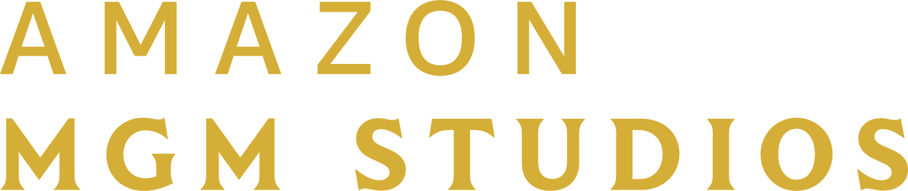
Amazon MGM Studios is Amazon's film and television studio. Amazon bought Metro-Goldwyn-Mayer in 2022, and in October 2023 Amazon Studios was renamed Amazon MGM Studios. The studio logo is a pure wordmark: "AMAZON" over "MGM STUDIOS" in gold #D4AE37, set in flared capitals with very wide letterspacing, usually on black. It borrows nothing from Amazon's retail branding (no smile arrow, no orange) and instead leans on MGM's Hollywood glamour: gold, black, theatre-curtain stillness.
Behind it sits the MGM heritage: Leo the Lion roaring inside a film-strip ring with the motto "Ars Gratia Artis", one of the oldest studio idents, refreshed in 2021 with a computer-generated lion, a gold palette and the "MGM" monogram with its long, dropping "G". Films may still open with Leo, United Artists, Orion or Amazon MGM Studios depending on the label.
The studio site (amazonmgmstudios.com redirects to mgm.com) is a black, full-bleed catalogue: hero imagery under a black gradient, white uppercase nav in Goldwyn Sans Bold, a thin gold underline on the active item, square buttons with wide-tracked uppercase labels. The press site (press.amazonmgmstudios.com) uses the Prime Video system instead (#0F171E, #00A8E1, Amazon Ember), which is useful context but not the studio brand.
What makes it recognisable:
- Gold on black. Gold wordmark, black field, almost nothing else.
- Extreme letterspacing. Logo caps are spaced wide; UI labels follow with 0.06-0.15em tracking.
- Flared, classical capitals. Glyphic serif-like terminals in the wordmark and the MGM monogram.
- Square, quiet UI. Zero-radius buttons, thin rules, no colour other than gold.
Density: low. Big images, few words, generous black space.
2. Color Palette & Roles
Brand (from official logo files)
| Name | Hex | Role |
|---|---|---|
| Studio Gold | #D4AE37 |
Wordmark on mgm.com, primary accent |
| Black | #000000 |
Logo background, ident background |
The Commons vector of the stacked logo uses #D3AD37, one step away; treat #D4AE37 (sampled from mgm.com's own logo file) as the reference.
Website (mgm.com CSS)
| Name | Hex | Role |
|---|---|---|
| Soft Gold | #D7BB73 |
Active nav underline (1px), nav hover text, slider handle border |
| Antique Gold | #80743C |
Loading text (18px, 4px tracking) and loader triangles |
| Warm White | #F8F7F6 |
Large headline text over banners |
| White | #FFFFFF |
Nav text, text on black |
| Header Gradient | linear-gradient(180deg, rgba(0,0,0,0.7), transparent) |
165px band behind the header |
| Stone | #DEDBDB |
html background outside the 1440px page |
| Footer Gray | #535353 |
Footer link text |
| Label Gray | #888888 |
Footer section titles |
| Backdrop | rgba(0,0,0,0.5) |
Buy-now popup backdrop; 0.9 for media modals |
Press site (Prime Video system, for reference)
| Name | Hex | Role |
|---|---|---|
| Prime Ink | #0F171E |
Background |
| Prime Navy | #1C2630, #232F3E |
Panels, header |
| Prime Blue | #00A8E1 |
Links, buttons |
| Amazon Orange | #FF9900 |
Highlights |
| Mist | #EAEDED |
Light text and dividers |
Semantic (approximate)
| Name | Hex | Use |
|---|---|---|
| Error | #E0524A |
Field errors |
| Success | #4CAF7A |
Confirmation |
| Focus | #D4AE37 |
2px focus outline |
Mode
Dark. Light panels appear in the footer and some list modules, but the brand surface is black.
3. Typography
- Goldwyn Sans is the custom MGM typeface used on mgm.com in Regular, Bold, Condensed Regular and Condensed Bold. It is proprietary. Fallbacks: Marcellus (Google Fonts) for display, since its flared capitals echo the wordmark; Jost for UI and body.
- Metro Mayer Serif (Regular and Bold) is loaded for editorial serif headings; Cormorant Garamond is a reasonable Google stand-in.
- Logo lettering (both the Amazon MGM Studios wordmark and the MGM monogram) is artwork. Never typeset it.
Scale (mgm.com values)
| Role | Size | Weight | Line height | Notes |
|---|---|---|---|---|
| Banner headline | 48px (3rem) | 400 (Bold cut at weight 100 in CSS) | 1.1 | Warm white, 1px tracking, centred over art |
| Block title | 32px | Bold cut | 30px | Section titles, 0.2px tracking, 30px bottom margin |
| Title | 24px | Bold | 1.2 | Card group titles (approximate) |
| Body | 16px | Regular | 1.5 | Synopses |
| Nav | 15px | Bold | 20px | Uppercase, white, 0.09px tracking |
| Button | 13px | Bold | 16px | Uppercase, 2px tracking |
| Footer label | 16px | Condensed Bold | 1.25 | Uppercase, #888, 0.95px tracking |
| Loader | 18px | 700 | 1 | 4px tracking, #80743C |
Rules
- Uppercase for nav, buttons, labels and footer headings.
- Wide tracking on uppercase (2px on buttons, 4px on loaders); none on body.
- Keep headlines short; one line over imagery.
4. Logo & Brand Mark
- Stacked wordmark. "AMAZON" on the first line, "MGM STUDIOS" on the second, gold on black, with heavy letterspacing; the second line runs slightly wider than the first. This is
logo.svg. - Horizontal wordmark. "AMAZON MGM STUDIOS" on one line, with "AMAZON" in a lighter weight and "MGM STUDIOS" bolder.
- Icon here. The "MGM" from the stacked logo, gold on black, as a short form for square spaces.
- MGM heritage marks: Leo the Lion in the film-strip ring ("Ars Gratia Artis"); the MGM monogram. Use only for MGM-labelled titles and heritage content.
- Colour versions: gold on black (primary), black on white, white on imagery.
- Clear space: at least the cap height of "AMAZON" on all sides.
- Minimum size: stacked logo 96px wide; horizontal 160px wide.
- Placement: top-left on the site, about 180px wide on desktop.
Misuse: do not add the Amazon smile arrow, recolour in Amazon orange or Prime blue, tighten the letterspacing, or set the wordmark in another font.
5. Components
Values from mgm.com CSS unless marked approximate.
Buttons
.btn {
  display: inline-flex; align-items: center; justify-content: center;
  width: 253px; height: 48px; padding: 15px 25px;
  font: 700 13px/16px "Goldwyn Sans", Jost, sans-serif;
  text-transform: uppercase; letter-spacing: 2px;
  border: 0; border-radius: 0;
  transition: background-color .3s ease, color .3s ease;
}
.btn-gold { background: #D4AE37; color: #000000; }           /* approximate fill */
.btn-gold:hover { background: #D7BB73; }
.btn-ghost { background: transparent; color: #FFFFFF; box-shadow: inset 0 0 0 1px #FFFFFF; }
.btn-ghost:hover { color: #D7BB73; box-shadow: inset 0 0 0 1px #D7BB73; }
.btn:focus-visible { outline: 2px solid #D4AE37; outline-offset: 3px; }
Header
.header {
  position: absolute; width: 100%; height: 165px; z-index: 20;
  background: linear-gradient(180deg, rgba(0,0,0,0.7), rgba(0,0,0,0));
}
.header .navbar { display: flex; padding: 1.5rem; }
.header .logo { width: 180px; }
.header .menu a {
  padding-bottom: 5px; color: #FFFFFF; text-decoration: none;
  font: 700 15px/20px "Goldwyn Sans", Jost, sans-serif;
  text-transform: uppercase; letter-spacing: .09px;
}
.header .menu .active { border-bottom: 1px solid #D7BB73; }
.header .menu a:hover { color: #D7BB73; }
Hero
Full-bleed still or trailer, header gradient on top, centred headline in 48px warm white, optional square gold button. The page is framed at 1440px max width, centred on a stone #DEDBDB canvas on very wide screens.
Title grid
Posters 2:3 with no radius and no border, 3-5 per row, 30px gaps (approximate). Hover: slight zoom (1.03) over 0.7s ease and a gold title.
Filters and sliders
Year sliders with black handles, 24px, 4px #D7BB73 border. Filter labels in Goldwyn Sans Condensed Bold uppercase.
Modals
Buy-now popup: backdrop rgba(0,0,0,0.5), centred dialog, header in Goldwyn Sans Regular, retailer buttons in a list. Media modals on black at 90%. Shadow 0 2px 40px rgba(0,0,0,0.4).
Loader
Full-screen white panel, 18px bold #80743C text with 4px tracking, small triangles (8px × 10px) in the same gold.
Footer
Light panel. Section titles 16px Condensed Bold uppercase #888 with 0.95px tracking; studio links (MGM, United Artists, Orion, American International Pictures) 16px Condensed Bold uppercase #535353, 135px wide columns on mobile.
6. Layout & Spacing
- Max width: 1440px page frame, centred (
html body { max-width: 1440px; margin: 0 auto; }). - Gutters: 24px (1.5rem) header padding; content 24-48px.
- Breakpoints: Bootstrap 576/768/992/1200/1400 plus custom 360-499 and 991-1150 ranges.
- Spacing: 8, 16, 24, 30, 48, 64px; block titles have 30px bottom margin.
- Density: low, with long black runs between modules.
7. Depth, Elevation & Motion
- Flat black with photography; one soft modal shadow.
- Header: gradient band, not a solid bar.
- Motion: content fades and slides in with staggered delays (
.5s .5s,.5s .6s,.5s .7s); hover zoomsall .7s ease; colour changes 0.3s. - Ident motion: the gold wordmark fades up slowly on black in trailers (approximate description). Keep web motion slow and smooth.
8. Iconography & Imagery
- Icons: Material Icons (outlined and filled) at 24px, white on dark.
- Imagery: film and series stills and key art from Amazon MGM Studios, MGM, United Artists and Orion titles (Bond, Rocky and Creed, Legally Blonde, The Lord of the Rings: The Rings of Power on Prime Video). Rich, dark, high-contrast crops.
- Heritage: Leo the Lion and classic MGM stills for history and library pages, in black and white or gold-toned.
- No illustration style; gold rules and black space are the only graphic elements.
9. Voice & Microcopy
Polished, restrained, classic Hollywood. Few words, no exclamation marks.
- Nav: "MOVIES", "TELEVISION", "STUDIOS", "ABOUT"
- Buttons: "VIEW ALL", "WATCH TRAILER", "BUY NOW", "LEARN MORE"
- Availability: "Only in theaters", "Now streaming on Prime Video"
- Corporate: "Amazon MGM Studios is home to Amazon's film and television production."
- Casing: uppercase for UI, sentence case for body.
10. Do's and Don'ts
Do
- Use gold
#D4AE37on black as the brand pairing. - Keep buttons square with wide-tracked uppercase labels.
- Use a black gradient header over full-bleed imagery.
- Use soft gold
#D7BB73for hover and active states. - Keep the page frame at 1440px.
Don't
- Don't use Amazon retail orange, the smile arrow, or Prime Video blue on the studio brand.
- Don't round buttons or posters.
- Don't tighten the letterspacing of the wordmark.
- Don't use Leo the Lion for non-MGM titles.
- Don't fill pages with colour; black and gold carry it.
11. Agent Prompt Guide
Paste this into a coding agent:
Build this UI in the style of Amazon MGM Studios. Black
#000000page, warm white#F8F7F6headlines, white body text, secondary text#888888. Brand accent is Studio Gold#D4AE37, with soft gold#D7BB73for hover and active states. Fonts: Goldwyn Sans if licensed, otherwise Marcellus for display and Jost for UI. Nav is 15px bold uppercase white with a 1px soft-gold underline on the active item, inside a 165px header band withlinear-gradient(180deg, rgba(0,0,0,.7), transparent)over a full-bleed hero. Buttons are square (0 radius), 48px tall, about 250px wide, 13px bold uppercase with 2px letter-spacing: gold fill with black text, or white 1px outline. Block titles 32px bold, banner headline 48px. Page frame max 1440px. Posters square-cornered, no shadows; motion is slow fades (0.5s with staggered delays) and gentle 0.7s hover zooms. Use the gold stacked wordmark SVG top-left; never type it.
:root {
  --brand-gold: #D4AE37;
  --brand-gold-soft: #D7BB73;
  --brand-gold-antique: #80743C;
  --brand-black: #000000;
  --brand-surface: #141414;
  --brand-border: #2A2A2A;
  --brand-text: #F8F7F6;
  --brand-white: #FFFFFF;
  --brand-text-secondary: #888888;
  --brand-footer-link: #535353;
  --brand-canvas: #DEDBDB;
  --brand-header-gradient: linear-gradient(180deg, rgba(0, 0, 0, 0.7), rgba(0, 0, 0, 0));
  --brand-font-display: "Goldwyn Sans", Marcellus, Georgia, serif;
  --brand-font: "Goldwyn Sans", Jost, "Helvetica Neue", Arial, sans-serif;
  --brand-radius: 0;
  --brand-tracking-button: 2px;
  --brand-shadow-modal: 0 2px 40px 0 rgba(0, 0, 0, 0.4);
  --brand-duration: 0.3s;
  --brand-duration-slow: 0.7s;
  --brand-max-width: 1440px;
}
Values are observed from the public product and published brand guidelines; this file is an unofficial reference and is not affiliated with or endorsed by Amazon MGM Studios.